From the archive
Click on the images to enlarge them.
The jubilee edition by Hollandsch Uitgevers Fonds (1929)
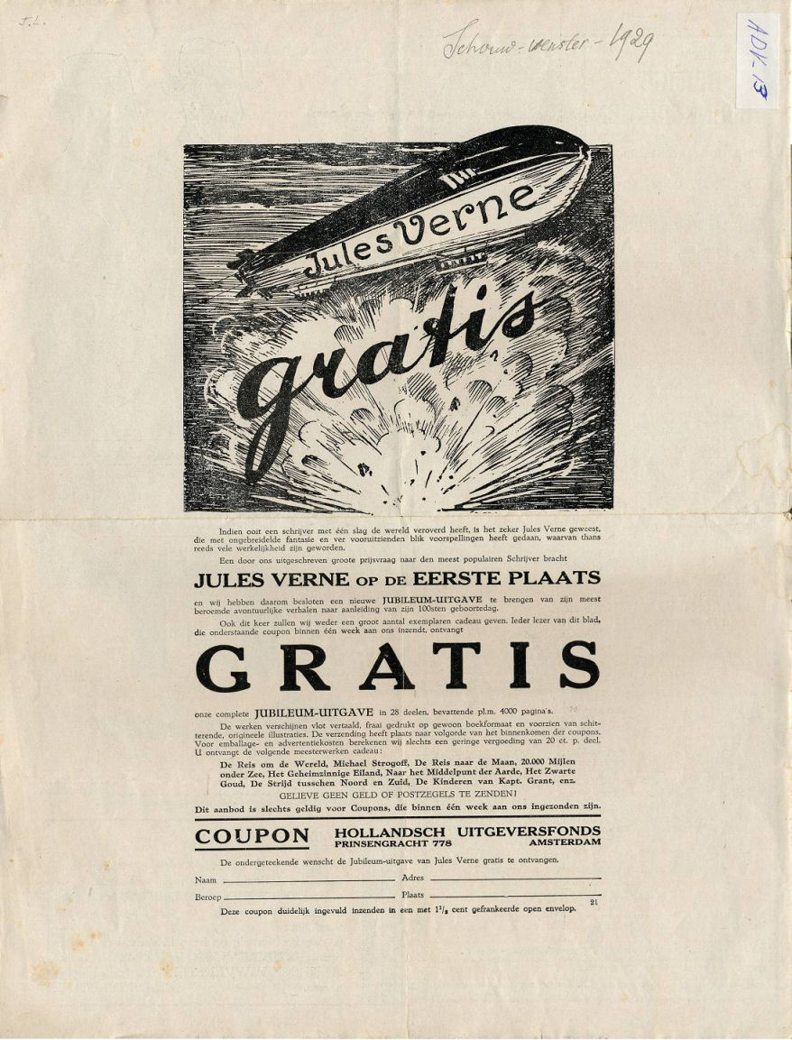
On the occasion of Jules Verne’s 100th anniversary, a new series was published in 1929 by the Hollandsch Uitgevers Fonds (HUF). This seems to have been an organization that published books and sent them directly to its customers. Advertisements were printed in newspapers or magazines, suggesting that the books were available for free (see fig. 1).
A citation from this advertisement:
We will again give away a large number of books for free. Each reader of this magazine who will have returned the coupon below within one week will receive our complete JUBILEE EDITION in 28 volumes, containing about 4000 pages, FREE OF CHARGE. These works contain modern translations, are printed in high quality on normal book size, and contain magnificent, original illustrations. Books will be shipped on a first come first serve basis. For handling and shipping, we charge a small fee of 20 cents per volume. You will receive de following masterpieces:
Around the world, Michael Strogoff, Moon, 20,000 leagues under the sea, The mysterious island, Journey to the centre of the Earth, The Black Indies, North against South, Captain Grant’s children. This offer is only valid for coupons that are returned within one week.
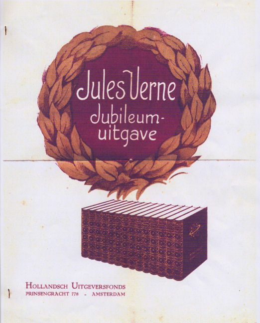
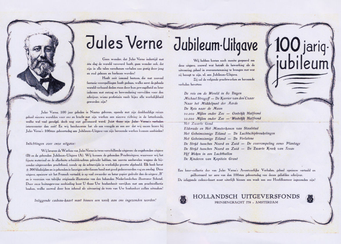
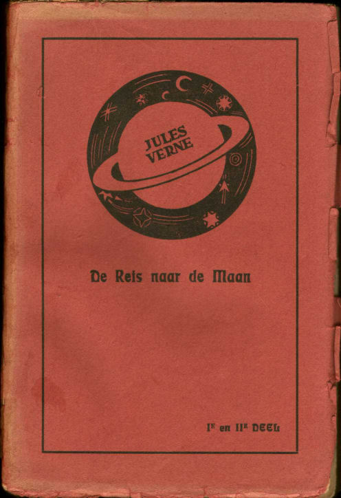
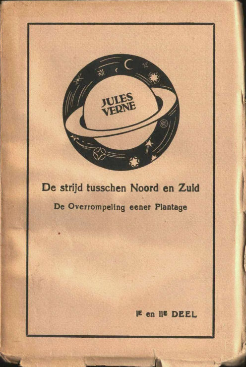
A nice folder was distributed to promote this series (fig. 2–4). Thr front and back show the books, the interior gives further information on the various versions:
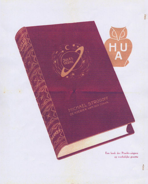
Two different versions: the unbound edition (B) and the bound Jubilee Edition (A). The De Luxe edition, for which we have used the finest materials and employed the best craftsmen, is highly recommended on account of the special cover, as shown on the back side. Each book contains approximately 300 pages and is bound in a real linen binding with gold-decorated spine and cover. This edition, newly translated from French, is printed on heavier and better paper than edition “B” and contains many original illustrations of the well-known Dutch illustrator Schotel. By means of our extraordinary offer you can enrich your bookcase with a magnificent collection of books, that will, on account of content as well as workmanship, be the pride of your bookcase!
The HUF was studied by Kees Waij in Verniaan 30 (2004), pp. 36-37, partly on account of a shipping label that he found. This label mentioned an amount of f 0.45 for shipping of two volumes and f 2.30 for two De Luxe editions, a total of f 2.75.
These data and our own observations regarding this series allow us to reconstruct what was going on. Comparing the advertisement and the leaflet, some inconsistencies show up. There are a luxury and a normal edition, but there is no mention of their prices. There is a mention of free books. Why does the leaflet distinguish so explicitly between editions A and B?
As Kees Waij suggests in his article, those who returned the coupon for free books within a week were probably made the offer to have the books bound in the famous linen binding, at a low extra charge. What happened to people who wished to receive the free books, but who did not accept the extra offer to have them bound? They did have a right to the free books?
In November 2005, Piet Akkerman bought ten stitched, uncut books from this series, printed on paper of questionable quality (see fig. 5–7). I suspect that this is the B edition mentioned in the leaflet. Due to the low quality, it is not surprising that today, 77 years later, these books are very rare.
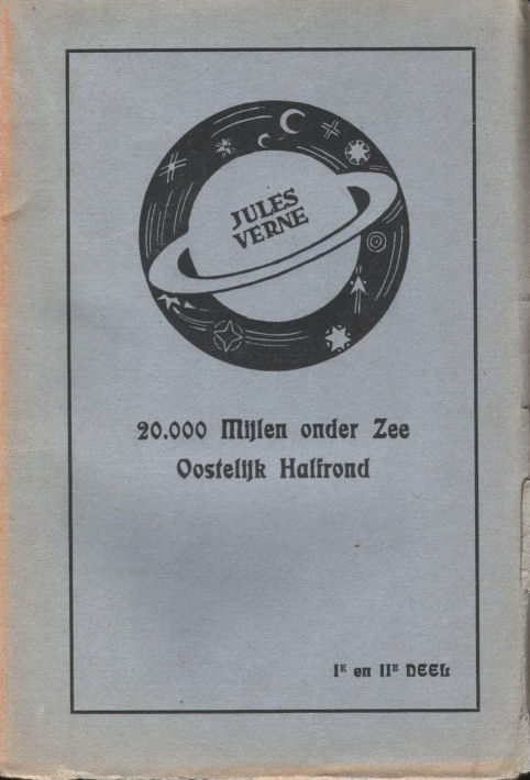
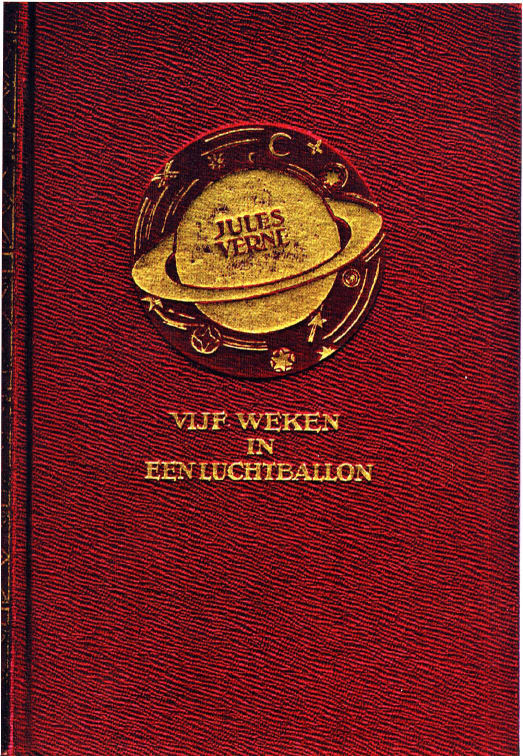
What about the books in the well-known soft cover (fig. 8)? These were printed on the same paper as the bound books and therefore not of quality B! This, like other variants of the series (blue, red, green and other covers), is presumably a later product meant to clear out the remainders of the luxury editions. On this occasion, Saturn was accidentally placed upright on the front.
What has come of the promises made in the advertisement and the leaflet?
- Number of titles
- Only 20 titles were published, not 28, as announced in the advertisement.
- Quality
- If there has ever been a magnificent edition, it has deteriorated significantly in 77 years.
- Number of pages
- Initially, each book would contain some 300 pages, and the entire series 4000. In reality, the average number of pages per book was about 256, yielding 5130 pages for the complete series!
- Size
- The advertisement claims that the books are printed on “ordinary book size”. Yet they are quite small, 18x13 cm, rather smaller than the blue covers.
- Illustrations
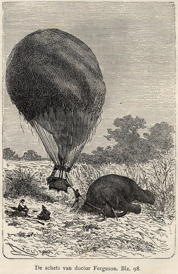
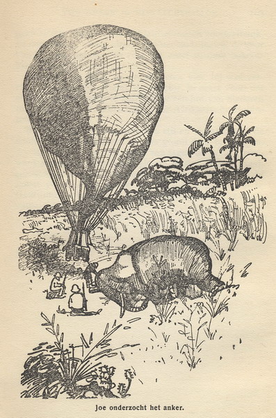
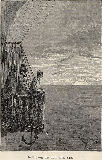
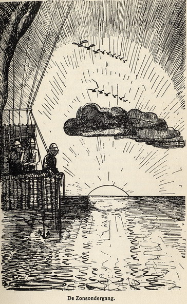
- The “magnificent, many original illustrations” were drawn by “the well-known Dutch illustrator Schotell”. On comparison with the original engravings, as included in Elsevier’s editions, we see that the illustrations by Schotel are badly done copies. Some examples are given below.
- Translation
- According to the leaflet, this edition contains a new translation from French. However, in view of the earlier conclusions, especially regarding the illustrations, I would not be surprised if these are adapted Elsevier texts. More research could shed light on this matter.